Friday, November 12, 2010

r & r


i'm off to georgian bay
for a little r & r
be back monday
---
above photos taken last visit


Wednesday, November 10, 2010

encaustic class

my last class of the year
i didn't have time to finish
so i added a bit more colour when i got home
and a photo in ps
when i get some time i'll do a permanent transfer

a few close up details
------
hopefully i will get some time before the holidays
to work in my studio


Monday, November 8, 2010

country grunge

on my country visit last week
i managed to find lots of grunge
above one of a bag full of rusted bed springs
not sure what i will do with them
but the perfect project will come along


i knew this sign would make a great grunge layer in ps


i've already used this in several projects
(see the 2 previous posts)


somebody's watching


Saturday, November 6, 2010

country time


a few shots from my day in the country
-------
layermask from shadowhouse


Friday, November 5, 2010


i think that I shall never see
a poem as lovely as a tree.

a tree whose hungry mouth is prest
against the earth's sweet flowing breast;

a tree that looks at god all day,
and lifts her leafy arms to pray;

a tree that may in summer wear
a nest of robins in her hair;

upon whose bosom snow has lain;
who intimately lives with rain.

poems are made by fools like me,
but only god can make a tree.

Joyce Kilmer
---------
i got to spend the day in the country with my friend ludgera
i managed to take 381 photographs
and will post some of my favorites tomorrow
above--one of the shots
a layer mask lu found on the internet
i added a bokeh layer from shadowhouse
and one of my own grunge layers
and then added a few scratches with a brush

Wednesday, November 3, 2010

encaustic class

this post is for all those who where wondering about encaustic
i've evolved over the past two years since i started regular classes
and i've accumulated lots of supplies
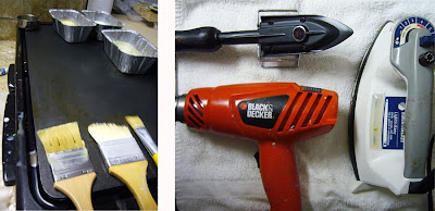
i've set up a space in my studio to work in when i'm not in class

above my new bigger hot plate from canadian tire
it has twice the heat surface and can now have 3 different mixes of wax
micro crystalline, natural bees wax and one with a combo of both
i use an old iron for smoothing out large canvases
a smaller iron from the fine art store in rochester and a heat gun


oil paint and oil sticks, brushes in many sizes and for different colours
metal tart tins, scrappers, dental tools, palette knife,
anything to "mark" or "carve" in the wax

i love the versatility of wax
i can incorporate all my mixed media lessons
and all the happy accidents that are created


you can buy pre-mixed paints but they are costly
i mix my own as i need them
i use metal tart tins, fill with wax and add oil paint
i can re use the same container again and again
and add more when needed

when i want just a "splash" of colour i use oil sticks
right on the heat surface and add a little wax to thin it


today i spent my time finishing some of my projects

above , i wanted to add some color and texture to
a photo transfer gone bad
( i accidental scrapped too much)
so with a little wax i covered it up


the sides always are the last to be finished
and sometimes forgotten
a little oil paint and mineral spirits
rubbed into the wax and then removed
the oil paint remains in all the "nooks and cranny's"
and highlights the texture
i got several canvases finished
hopefully they will be sold for christmas

Monday, November 1, 2010

step by step

my friend ludgera and i have been working on some ps projects
she is just learning how layers work (she calls it layer soup!!)
so to help her out we e-mail back and forth photos and projects
learning how to adjust each layer as we go and most importantly
playing and learning something new
lu sent me a photo of the last full moon ( left)
(we are both cancerians and ruled by it!!!)
i added a purple photo filter and flipped it vertically
and cropped it

a graveyard photo from salem, ma
and an old photo was one of many i found at the
old paper show a few years ago
i used the "color burn" blending mode on the graveyard photo
it made the purple a little too intense
so i adjusted the saturation
and added the portrait
and set the opacity at 50%

the image was starting to take shape but
was lacking a gory feel
i tried adding blood with the paint brush
but didn't like the results
if only i had some dripping blood...
well after a bit of thinking and searching

i found a painting i did several years ago
i liked the way the ink dripped
so i converted it to bw and erased what i didn't like
inverted it and added a red photo filter


it works well over the project
to finish it off i added a bat on the moon
and used "bleeding cowboy" font
see yesterdays finished project
also take a look at another one of my
halloween projects on my flickr page here

-------
it's fun and challenging
working with lu
she is getting me to work on things that i
would not have tried on my own
thanks lu
 
© The Evolution of Nancy
CoffeeShop Designs